Ever wondered what your music taste would look like if it were turned into colors? A Spotify color palette is a creative way to visualize your musical personality using beautiful, vibrant colors that represent your listening habits.
These amazing tools analyze your top songs, favorite artists, and music moods to create a unique color combination that’s totally yours.
If you love energetic pop music that shows up as bright orange or prefer chill indie songs that appear as calming green, your Spotify color palette tells the story of who you are through music.
From sharing on social media to inspiring room decor, these colorful representations have become a fun trend that connects music lovers worldwide.
Understanding the Spotify Color Palette
Color palettes didn’t come from Spotify itself. Third-party developers and music fans created these cool tools to turn your listening habits into beautiful colors.
These palette generators look at your most-played songs and artists from your Spotify data. Then they match different moods and music styles to specific colors. Upbeat pop songs might show up as bright yellow or orange.
Sad ballads could appear as deep blue or purple colors instead. Electronic music often gets neon green or pink colors.
Your personal color palette becomes like a visual fingerprint of your music taste. It shows what genres you love and what moods you listen to most often throughout the year.
What the Colors Say About You
Your Spotify color palette tells about your musical personality and listening habits every day. Each color connects to different music genres and the emotions they bring out in you.
- Red usually means you love passionate music like rock, pop, or intense rap songs.
- Orange shows you enjoy upbeat dance tracks and energetic party music that gets you moving.
- Yellow appears when you listen to happy, cheerful songs that boost your mood instantly.
- Green means you prefer chill music, such as indie, acoustic, or relaxing background tunes for studying.
- Blue shines in emotional ballads, sad songs, or deep, contemplative music played late.
- Purple often represents alternative, experimental, or artistic music that feels unique and creative to you.
These color meanings help you understand your music taste in a completely new visual way. Your palette becomes like a musical personality test that shows what moves your soul.
Spotify’s Official Branding Colors

Spotify uses three main colors that make their brand instantly recognizable around the world. These colors work together to create the clean, modern look that millions of users see every day.
1. Green
Spotify’s signature green is the most important color in their brand identity. This bright, vibrant shade represents energy, growth, and the fresh feeling of discovering new music.
The green makes Spotify stand out from other music apps and creates a sense of excitement when you see it.
It’s the color that appears on their logo, buttons, and most promotional materials across all platforms.
2. White
White serves as the perfect balance to Spotify’s darker elements and creates clean, readable text areas. This color represents simplicity, clarity, and makes the interface feel spacious and organized.
White helps users focus on their music without distractions and ensures all the important information stays easy to read. It’s essential for creating contrast against the dark backgrounds that Spotify loves to use.
3. Black
Black dominates Spotify’s design as the primary background color that defines their sleek, modern appeal. This color choice reduces eye strain during long listening sessions and makes album artwork pop with vibrant colors.
Black also saves battery life on phones with OLED screens and gives Spotify a premium, urbane feel. It’s the foundation that holds their entire visual design together perfectly.
Color Terminologies
Spotify’s official color palette plays a vital role in shaping its sleek, modern, and easily recognizable branding. These colors are carefully selected to reflect the platform’s bold identity and user-friendly design.
| COLOR NAME | HEX CODE | RGB VALUES |
|---|---|---|
| Spotify Green | #1DB954 | R: 29, G: 185, B: 84 |
| Light Green (Logo) | #1ED760 | R: 30, G: 215, B: 96 |
| Black | #191414 | R: 25, G: 20, B: 20 |
| White | #FFFFFF | R: 255, G: 255, B: 255 |
This table provides the essential HEX and RGB values you can use in designs, themes, or Spotify-inspired graphics to maintain brand consistency.
How to Generate Your Own Spotify Color Palette
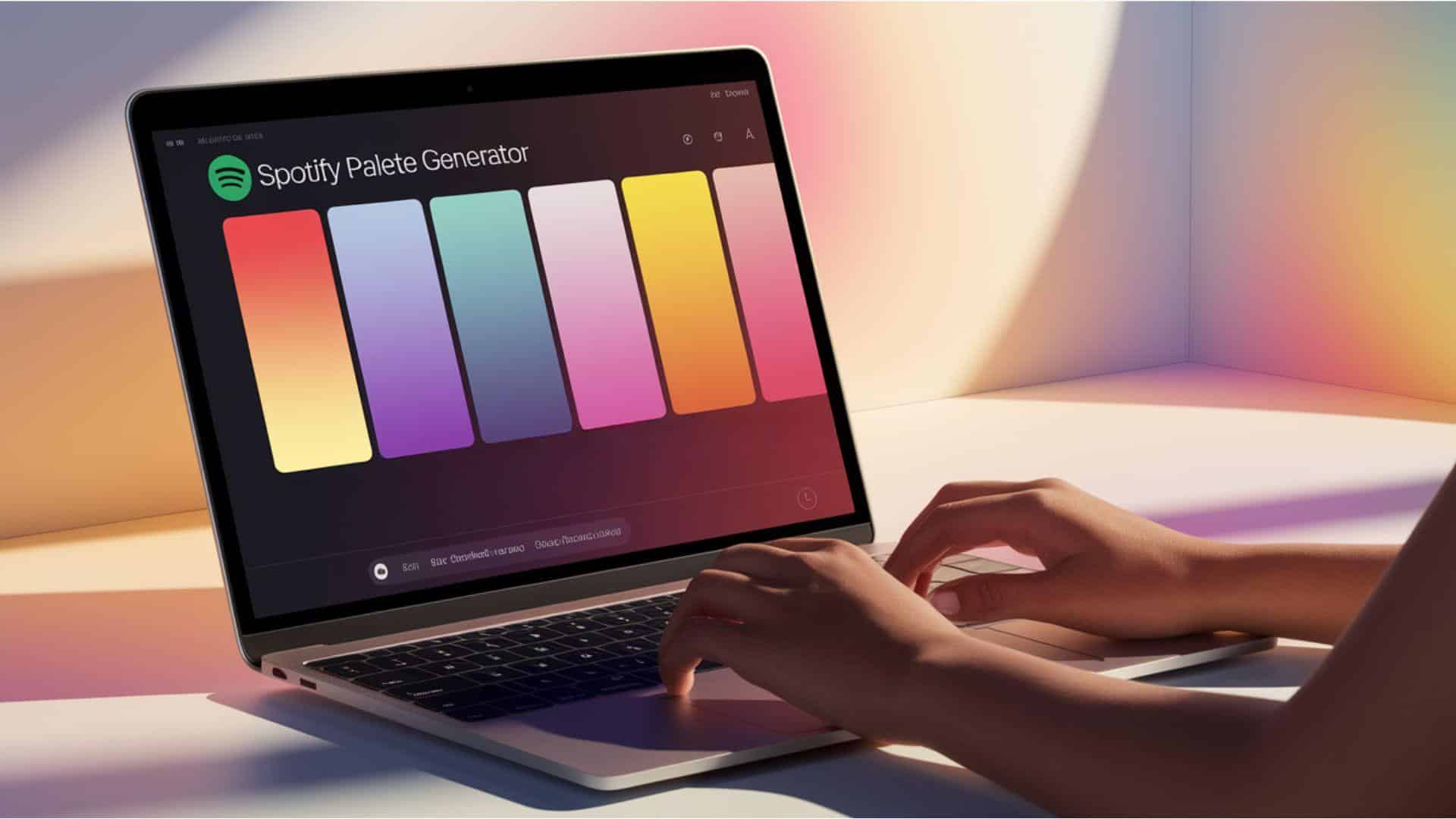
Creating your Spotify color palette is easier than you might think with the right tools. These steps will help you turn your music taste into a beautiful visual representation.
- Visit a Spotify palette generator website, such as Spotify Palette or Kaleidosync, in your web browser.
- Log in to your Spotify account when prompted and give the tool permission to access your data.
- Wait for the generator to analyze your top songs, artists, and listening habits from recent months.
- Download or screenshot your personalized color palette once the tool finishes creating your unique design.
- Use color picker tools on album covers manually if automatic generators don’t work for you.
Once you have your palette, you can use these colors for art projects or social media posts. Your unique color combination represents your musical personality in a way that’s totally your own.
Designing with Your Palette
Spotify’s color palette can inspire way more than just music playlists. These colors work perfectly for redecorating your bedroom, choosing new clothes, or creating custom phone wallpapers that match your vibe.
If your palette has lots of pink and purple, you might love the dreamy vaporware appearance. Dark blues and greens could mean you’re drawn to cozy dark academia vibes with vintage books and coffee shops.
Try painting an accent wall using your primary color, or find throw pillows that match your palette. You can even use these colors to plan your next outfit or design Instagram posts. Your music taste becomes a complete lifestyle appeal that feels totally authentic to who you are.
The Social Impact of Sharing Your Palette
Sharing your Spotify color palette creates instant connections with people who have similar music tastes. When you post your colors on social media, friends can see what genres and moods you love most.
These palettes started trending on Instagram, TikTok, and Twitter as people compared their musical personalities. Some users even created challenges where they guess friends’ favorite artists based on their color combinations.
The trend helps music lovers find new friends with similar vibes. You might know someone else with your exact green and purple palette who loves the same indie artists you do. It’s like having a visual conversation about music without saying a single word about specific songs or bands.
Creative Uses of Your Spotify Palette
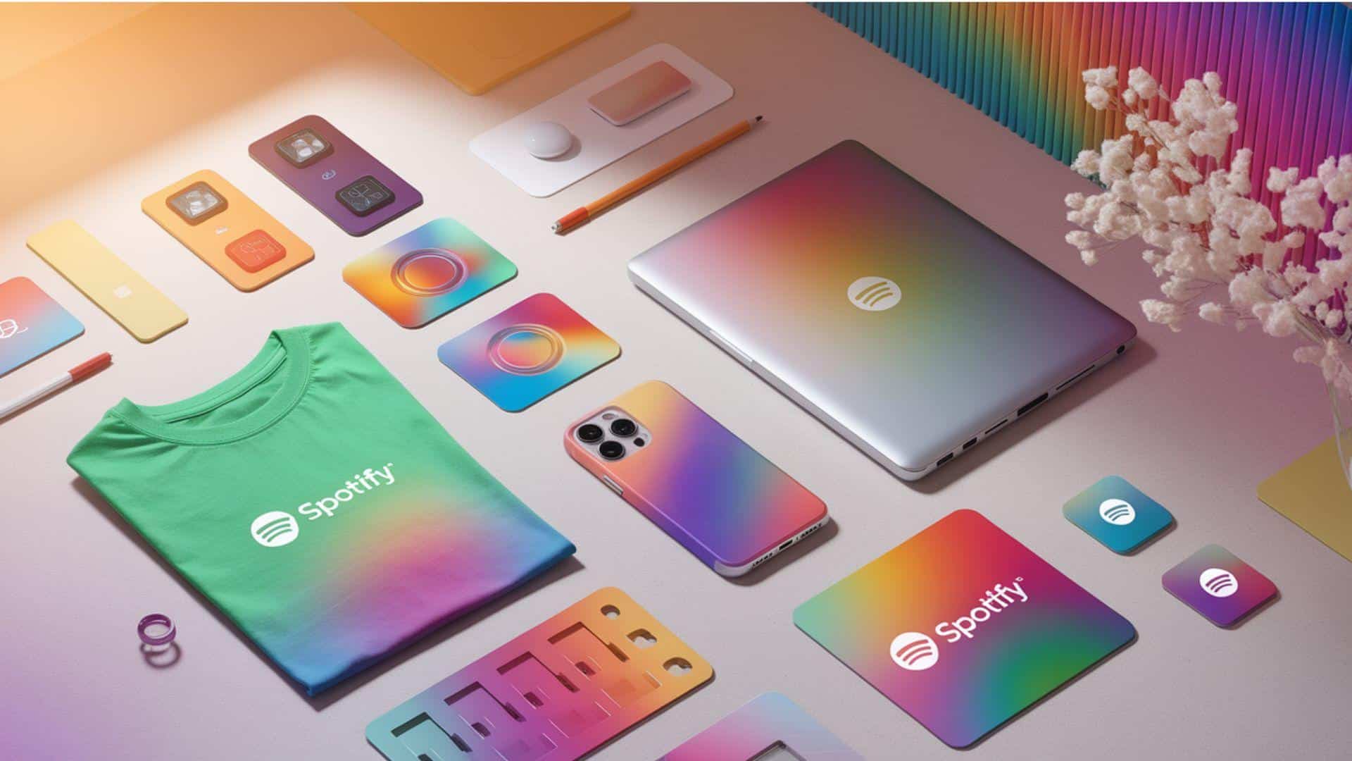
Your Spotify color palette can inspire amazing creative projects that show off your musical personality. These ideas help you bring your music taste into the real world in fun ways.
- Create custom t-shirts or hoodies with your palette colors as gradient designs.
- Design phone cases, laptop stickers, or water bottles showcasing your unique musical colors.
- Use your colors to customize app icons, wallpapers, or social media profiles.
- Paint bedroom walls with an accent color or find matching bedding sets.
- Get inspiration for small tattoos using your palette colors in abstract designs.
These creative projects make your music taste visible in your daily life and personal style. Your color palette becomes a way to express who you are beyond just listening to songs.
What’s Next? Future of Visual Music Tools
Music and visuals are becoming more connected than ever before, and the future looks pretty exciting. We’re already seeing apps that turn songs into moving artwork and create custom animations based on beats.
Spotify Wrapped might soon include AI-generated art that matches your listening habits perfectly. Imagine getting a unique digital painting or animated video that shows your year in music visually.
Some companies are exploring AR features where you could see your music colors floating around your room.
NFT artwork based on your playlists could become collectible items you actually own. These tools will make music feel more personal and shareable than simple playlists ever could before.
Final Thoughts
Your Spotify color palette is more than just a collection of pretty colors; it’s a reflection of your musical soul and personal style.
If you’re designing custom merchandise, redecorating your space, or simply sharing your musical personality online, your Spotify color palette opens up a whole new way to express yourself.
As technology continues to evolve, we can expect even more exciting visual music tools that blend art with our listening habits.
Your unique color combination is waiting to be found and shared with the world. Comment below your thoughts on what your color palette says about you!

